September, 2018
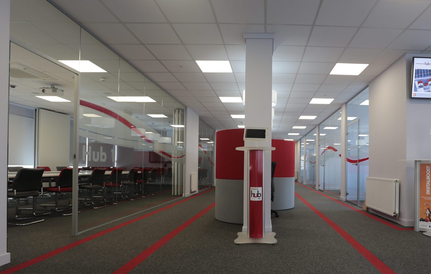
One of the most innovative aspects of modern design is that of the concept of wayfinding. This is a process by which designers can guide workers, visitors and the visually impaired around a space. By using coloured flooring to create pathways and points of interest, you’ll create a more accessible working environment.
Wayfinding is the science of guiding occupants through a building using colour. When it comes to commercial flooring, a design choice you make can either help or hinder those using the office, especially those who may be in some way impaired, allowing them to quickly and easily understand key areas such as fire exits, workstations and toilets. Wayfinding is particularly useful in healthcare environments, where unwell patients and visitors need clear and direct guidance through what can be an unfamiliar structure.
Green for go
Installing green tiles amidst more neutral tones creates a pathway that people will naturally follow. This is useful when creating paths to workstations or rest areas such as cafeterias. Combined with traditional signage, this ensures no newcomers will ever get lost on their first day – and also subconsciously encourages people to head to the areas you most want them to visit.
Yellow for caution
Experimenting with yellow to inspire caution is useful in an office environment. While red should be reserved for dangerous areas and exits, yellow is the perfect choice for smaller hazards such as steps and raised platforms. A yellow horizontal strip creates a clear barrier where office workers will stop and think before continuing, reducing their risk of trips.
Red for no
Red, the colour of danger, also works well when used as a single horizontal line at key points such as fire exits. Red immediately prompts a pedestrian to stop and assess the situation, so it’s a useful colour at both dangerous points and at rescue zones such as fire extinguishers.
Link up your lines
For wayfinding to be as effective as possible, it is important to consider linking floor tile patterns with a visual key that users grow familiar with. If your main desk area is predominantly one colour, create a pattern that leads towards it and utilises that colour. Adding a line on your walls can also help wayfinding – especially in larger office spaces or commercial environments.
Obviously, wayfinding requires more than just flooring. However, with the right choices in key areas, you can create a commercial environment that is highly accessible and therefore more productive. Even smaller offices benefit from the warning tools visual wayfinding can offer. Combine coloured flooring with smart visual cues on walls, perhaps using a feature wall, to give your occupants a space that makes sense from the moment they first enter.

October, 2017
Location is often a top priority for companies looking to move or set up…
November, 2017
Geometric flooring is essential to the latest Scandi look. We explore how pattern creates…
November, 2017
The workplace is changing, with less space and more multi-functionality. Smart office design means going…