January, 2019
What office design colours are good for your employees’ well-being and productivity? This article explores the best colours to use on the floors and walls to make your employees work hard but also stay calm.
When it comes to designing an office space, there’s often a lot of thought put into what colours should be used. Previously, there have been two main industry trends in business colour schemes. One is for neutral colours, and the other was for the company’s brand colours to be used within the workplace.
There’s one specific problem with these types of colour schemes. Both can result in poor work performance, poor employee well being, and ultimately less productivity.
Sullen moods
Another problem is that what demotivates men and women can be different. A study by the University of Texas found that bland grey, beige and white in the office can make female workers feel gloomy and depressed. In contrast, purple and orange spaces are more likely to make men feel gloomy.
So bland colours are likely to make female workers less productive. And if you have any purple or orange incorporated into your branding and then your office space, it could have the same impact on the men in your workplace.
Basic colour choices that can emulate nature
Using natural colour schemes within your workspace can be an effective way to boost productivity. For some this means using more organic materials within the design like wooden benches, desks and chairs. But the colour schemes around the office should also be integrated into a natural feeling for the office.
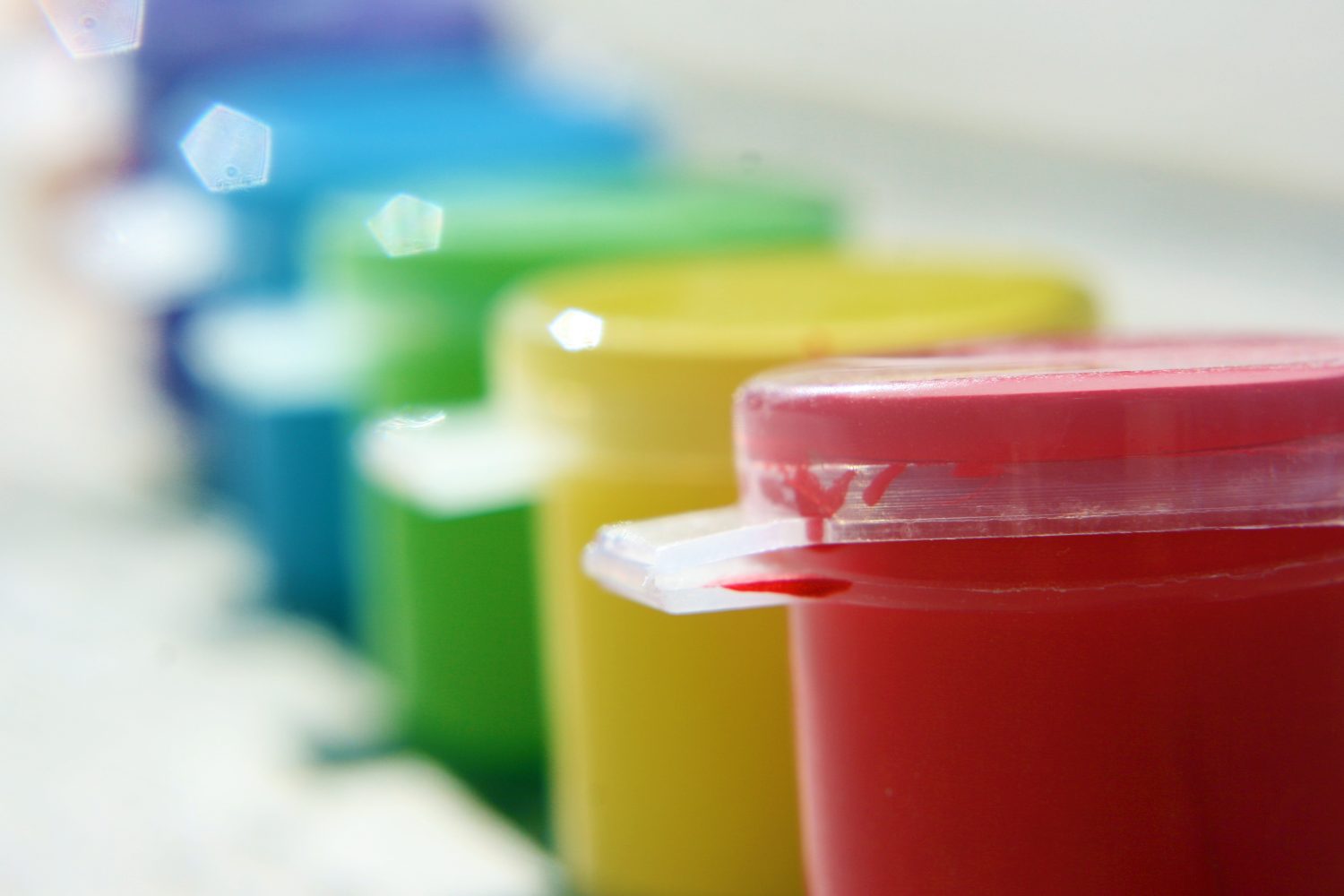
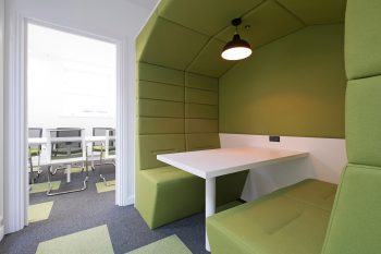
When choosing the colour schemes for the office walls and your commercial flooring, you could also emulate the outside. You can use accents of restful green as part of the flooring plan, and introduce a calming blue on the walls to represent open spaces. These two colours are the most common colours seen in nature.
Blue is particularly good for those working in jobs that require maximum focus like administration or project work. Blue helps to focus the mind and allows workers to concentrate. Green is great as a calming influence on workers. It is used as it is a balance between the primary colours and doesn’t strain eyes. It also helps create a calm environment, so those that work in stressful positions might benefit from a little green in the office.
Getting the heart pumping
However, you don’t want your employees always calm and relaxed. They sometimes need to be alert in their roles. Those that would really benefit from red colouring in the office would be those that are very physical like personal trainers and sales people.
Red can also be good to use in office designs sparingly to draw attention to specific points rather than a general colour scheme. However, red is also known to increase blood pressure and even tension within the workplace. Therefore, if you are trying to create a more harmonious workspace, then you need to stay away from red.
Yellow is another good colour for those looking to increase emotion in the workspace. Yellow is great for energising employees and increasing productivity. It is also the perfect colour if you work in a creative industry, or there is a need to have some optimism put into the work day.

August, 2017
For when four walls and laminate flooring just won't quite cut it, here are…
August, 2017
How can practical office design affect employees' productivity? We take a look at the…
October, 2017
Location is often a top priority for companies looking to move or set up…