March, 2020
It’s official! Playful use of colour, texture and the addition of the Pantone Colour of the Year (Classic Blue) will be prominent features of commercial office layout upgrades for 2020. Plus, add hints of the natural world to any workplace setting in 2020 and you’re certainly onto a winner.
How can the use of colour create a happier workforce?
The use of statement colours within striking combinations can recreate that childlike joy in adults (referenced in the Antron colour trends report 2019/20). Duraflor Trend carpet tile range meets a two-fold need, pops of colour yet an element of subtle sophistication. Getting just the right contrast to make the statement, and simulate the senses, yet be tonally quite subtle and playful is exactly what the latest trends are indicating .
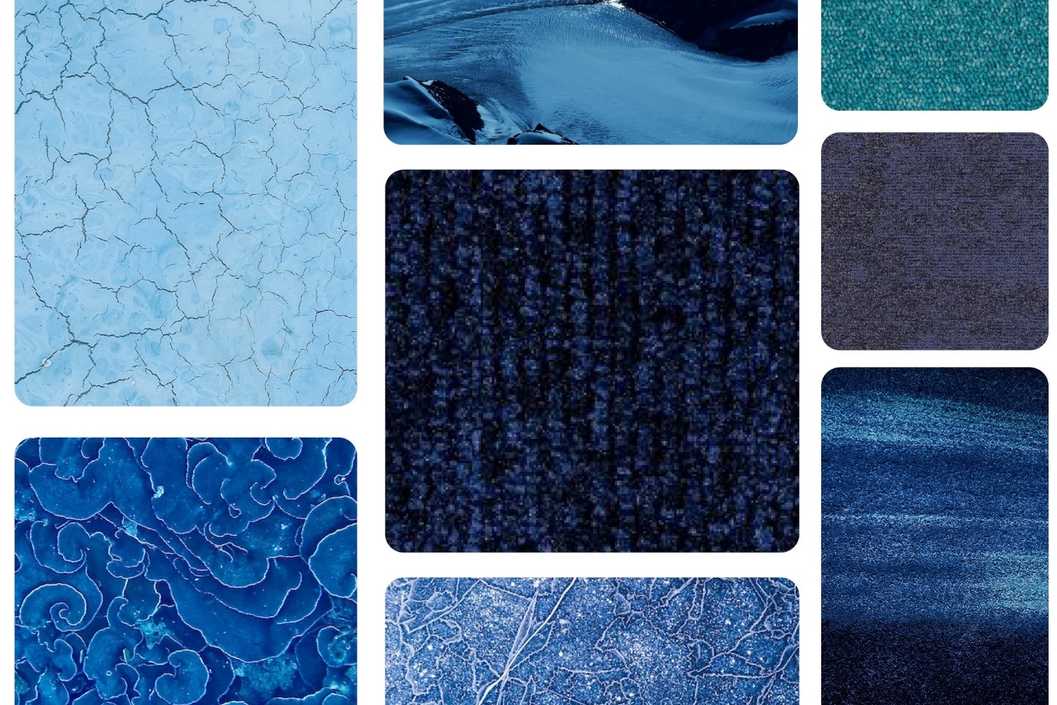
The role of Pantone Classic Blue 2020 Colour of the Year
One of the reasons Classic Blue tones help build levels of workplace happiness is down to the everlasting natural appeal of blue. Opting for the deepest shades of Classic Blue adds hints of twilight to the workplace, which is sure to create positive, yet tranquil vibes. Using different tones of blue to add decorative accents is even more of a dramatic style statement for 2020 office spaces, and could even build productivity by awakening heightened creativity.
Our Trend carpet tiles offer lots of ways to add texture and a pop of colour to the office, and we predict the Duraflor Celestial Blue will be very popular in 2020. This range has a contrasting darker stripe which helps reduce levels of soiling, and the different colours combine perfectly to add a playful, zesty pop to any workplace.
Seek inspiration from the colours and textures of the natural world
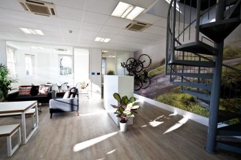
Office layouts of today are far more flexible than ever before. Creating a layout that manages to bring the outside world into the office is increasingly popular. Of course, natural materials and colours are the other big decorative style statements for the year, and our Natural Terrain Collection of carpet tiles or maybe Freedom Bark could be the perfect complement to any living wall or biophilic layout you plan to create.
Check out more of our recent posts on the use of colour in commercial settings, or get in touch with the experts at Duraflor today. We’ll be happy to share our expertise or discuss any commercial flooring concerns/office layout issues that may be concerning you.

October, 2017
Location is often a top priority for companies looking to move or set up…
November, 2017
Geometric flooring is essential to the latest Scandi look. We explore how pattern creates…
November, 2017
The workplace is changing, with less space and more multi-functionality. Smart office design means going…