December, 2019
Here are four tips on how to choose an office colour scheme and commercial flooring to both satisfy employees and impress clients when you bring them in for meetings.
A large part of how an interior space feels comes down to the colour scheme chosen. Different colours schemes are used to create different atmospheres. Bright and bold colours may be used to inspire and spark ideas, whereas pastel tones are more calming and stress-relieving.
The difficulty comes when you are trying to choose an interior colour scheme to suit several different needs. So what tips should you take on board if your office space is also where you meet and work with clients?
1. Divide your rooms up
There’s no need to choose one colour scheme for every space in your office. While you don’t necessarily want to use every colour under the sun, you can definitely vary your colour schemes in different rooms.
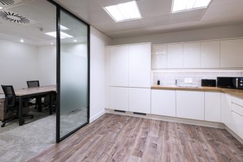
White, for instance, works really well in kitchen areas because, psychologically, we associate it with cleanliness. Yet white in a main office area or meeting room might come across as boring. We found an interesting article on the subject.
You could pair the white colour scheme with a distinctive vinyl flooring for maximum impact, as the kitchen is somewhere that spillages are likely to happen. White walls can easily be lifted with the use of multi-tonal luxury vinyl planks, see this beautiful case study.
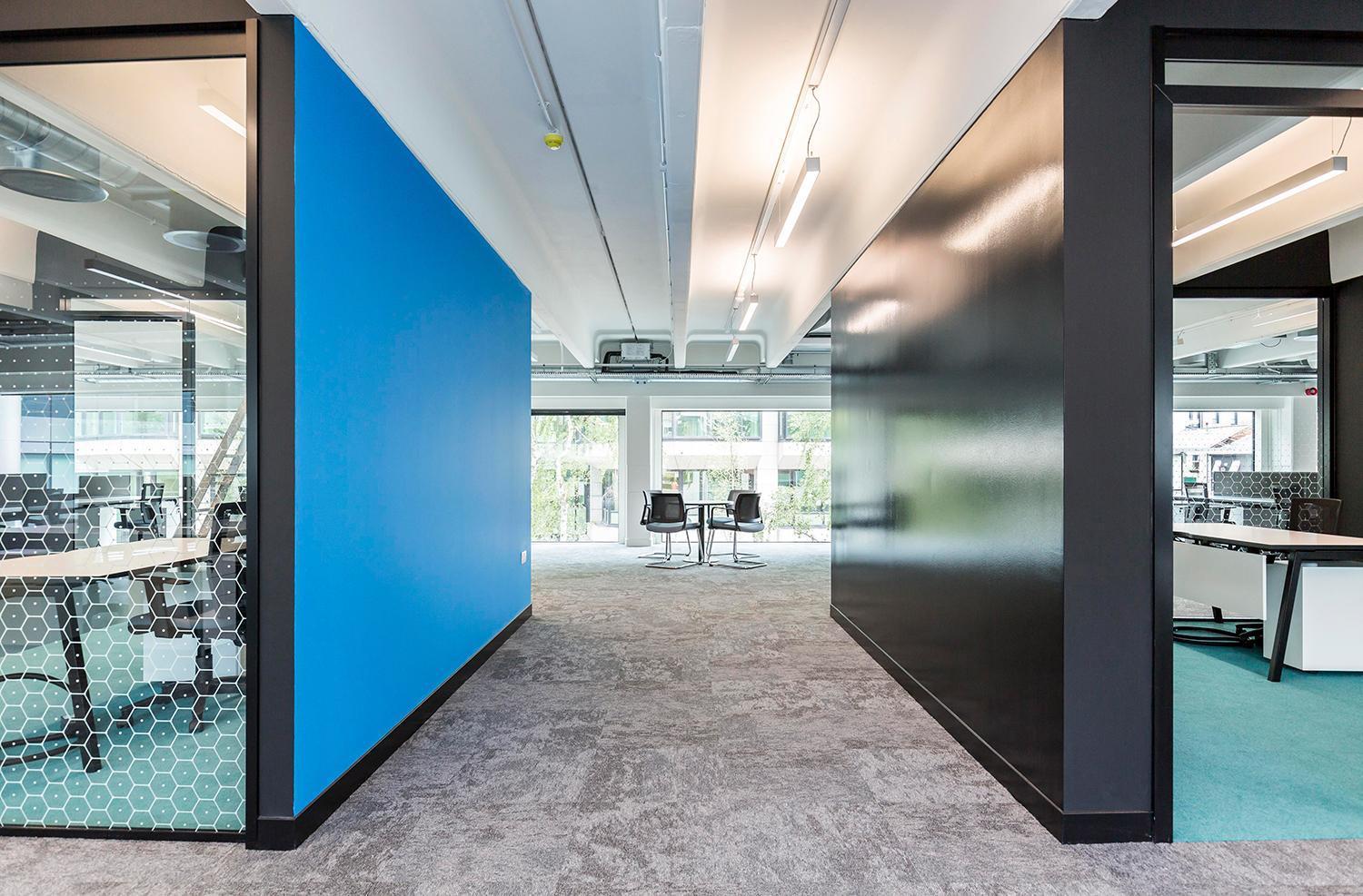
2. Use a little black
Black is a powerful colour that people associate with strength and control. It can be a very smart choice in a meeting room, but we suggest you only use a little bit and ensure you pair it with a bright colour.
Too much black can create a sinister, cold feel, especially as it absorbs light. We especially like this very contrasting use of black with white and real pops of colour – it is perhaps one of our favourite case studies.
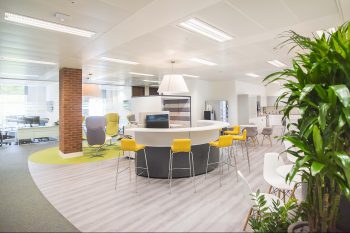
3. Professional but interesting
The perfect balance when you’re trying to please both employees and customers is to go for a colour scheme that looks both smart and professional but is also interesting. The colour scheme you use creates a certain atmosphere and ensures everyone in your office feels happy with the space they’re working in.
This can be achieved quite simply by choose a neutral main tone such as cream and adding in whatever pop of colour works with either your brand or the atmosphere you want to achieve. One technique which works well in offices is to have neutral flooring paired with pops of colour in the walls. A pale vinyl flooring that’s made to look like wood can be a great choice. Or maybe go for a carpet with interesting patterns like this great case study, then keep the walls fairly plain.
4. Think about the vision of your business
What is your business trying to do? Why not try to match your interior colour scheme with the ambitions behind the business?
If your company is something to do with mental health, you might choose blue as your main colour, a shade reminiscent of peace and inspiration. If your brand is more to do with luxury, whether it be luxury furniture or clothes, you might go for a more royal shade, such as purple.
Of course you may even decide the Pantone colour for 2020 is for you. Interesting that we have moved from Coral Pink to Classic Blue. The colour is meant to recognise a period of uncertainty as we enter 2020 and to offer that all important calming influence to staff and visitors – a choice you probably can’t go wrong with, if that is what you want to achieve.

Image Credit: Kirsi Goldynia/CNN


November, 2017
Geometric flooring is essential to the latest Scandi look. We explore how pattern creates…
November, 2017
2018 will focus on workspaces that integrate comfort and technology. Modern office designs play…
December, 2017
When high-performance floor covering is needed, specifiers are increasingly turning to updated versions of…