July, 2019
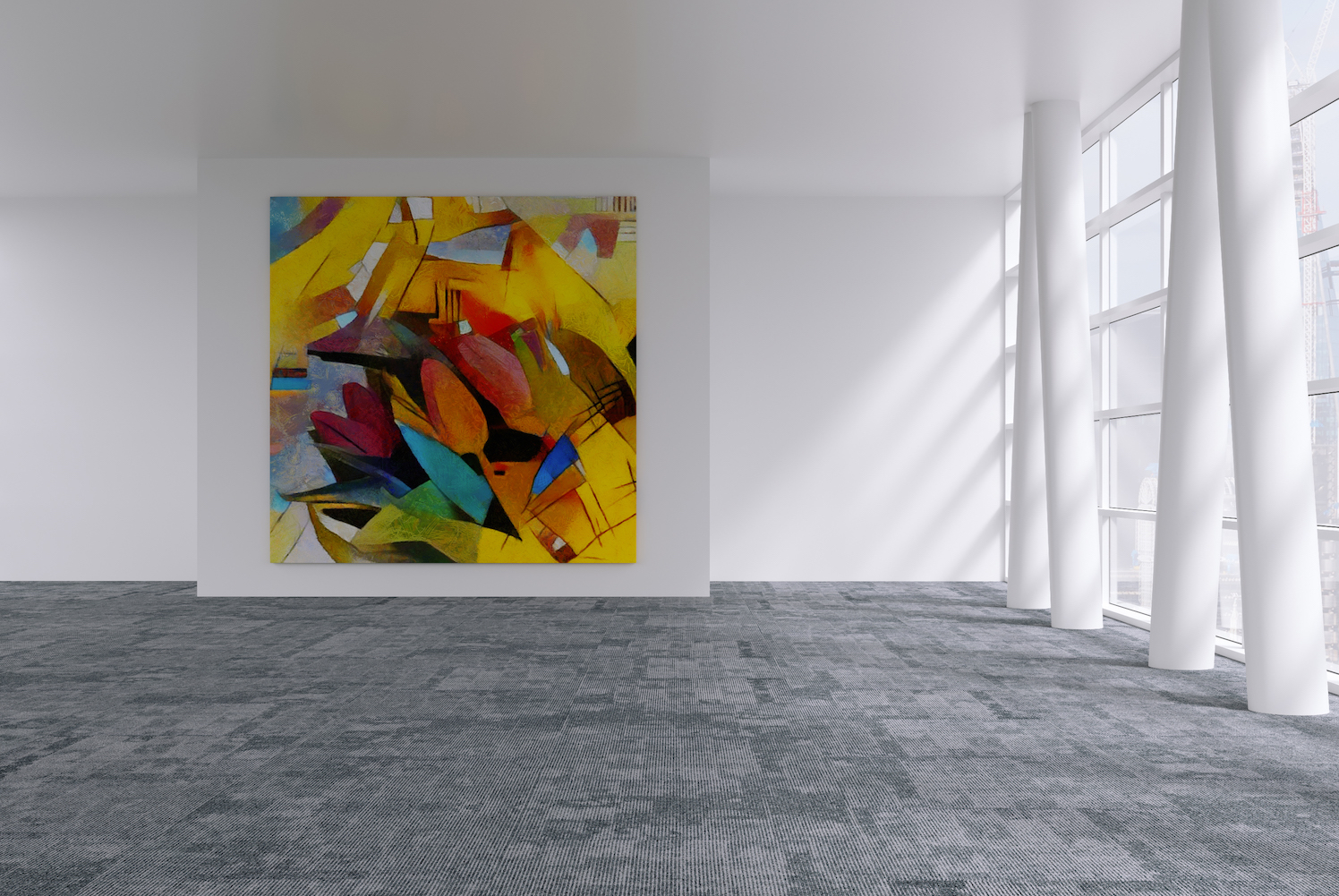
Popularised between the years of 1924 and 1940, art deco is an art movement that utilises bold colours and design. It features geometric patterns and draws influences from cubism. Room renovation and art often inspire each other, and as of late art deco has been making its way into many offices and commercial buildings. Here are some of the ways that the versatility of carpet tiles can be used to mimic art deco.
Geometric patterns
One of the most distinctive features of art deco is its vibrant geometric shapes. Although hexagon tiles have been coming into fashion lately for their unusual honeycomb tessellation, they’re also perfect for replicating the simplicity of art deco. Our Hexxtile range is the perfect combination of playfulness and simplicity. Try alternating bright colours that sit opposite each other on the colour wheel for a bright contrasting effect sure to grab the eyes of anyone that walks by. Check out the works of Sonia Delaunay, who pioneered the use of geometric shapes in fashion, for more inspiration.
Varying line thicknesses
Art deco was so popular in its heyday that it even inspired its own Gatsby-esque font. You’ll probably recognise it. Try replicating this font by varying the line thicknesses in linear carpet tiles. Unless you’re aiming for a very striking effect, we would recommend that you stick to same or similar shades of colour throughout laying. Alternatively, take a look at the new Magnitude range for more linear inspiration.
Colour choices
As we’ve previously mentioned, colour plays a large part in showing off that distinctive art deco style. One of the most famous art deco establishers is Jean Dunand, who was renowned for his use of black, red and yellow. This translates well into carpet design for bright casual spaces. If you’re wanting to design an office space that’s contemporary and promotes an upbeat mood, then vibrant colours are perfect Alternatively, try layering with cooler shades of blue and green when designing for more productivity-centred rooms. If you’re interested in more of how colours can change a room’s mood, check out this blog post by us.
Touch of glamour
Underpinning art deco is the fine nuance of glamour and modernisation. With the prominence of abstraction in interior design recently, it’s the perfect time to utilise the subtlety of decadent colours. These are usually more muted colours such as tan colours and creams; an excellent example of this is the 1930 cover of Vogue by Harriet Meserole. Like blues and greens, clean colours such as whites and creams elicit a feeling of calmness in office spaces, making them perfect colour combinations to unconsciously promote work rate. To bring such glamour to life on floors, we recommend a motif design of squares or other simple shapes in slightly varying tone differences for a truly luxurious touch of the 1930s. See the Freedom Pavement carpet tiles for a sample of how simplicity can be divine in interior design.

October, 2017
Location is often a top priority for companies looking to move or set up…
November, 2017
Geometric flooring is essential to the latest Scandi look. We explore how pattern creates…
November, 2017
The workplace is changing, with less space and more multi-functionality. Smart office design means going…